
It’s only logical I suppose that pie hating spills over to doughnuts. After all a doughnut is a disguised pie isn’t it? Personally I think a doughnut is a very good way of disguising a pie, doing away with a load of redundant non-functioning ink in the middle.
But here’s an anti-doughnut post by Andy Cotgreave that offers a design makeover.http://gravyanecdote.com/blog/makeovermonday/makeovermonday-bandwidth-hogs/?utm_content=buffer9257b&utm_medium=social&utm_source=twitter.com&utm_campaign=buffer
I agree with Andy that the main problem with this chart is in organising the legend. Having 9 entities at the side you need to go back and forth between the legend and pie, sorry doughnut, to read it.
For those of us naive enough not to believe that all pies are evil, there is a sensible rule of thumb that says pies can tolerate being sliced into a maximum of 6 pieces. But like all rules, you should be willing to break that when you need to.
I think it’s debatable with this one. There is something intuitive about showing bandwith in this way, like a cable divided. For anyone who has struggled with limited bandwidth, this is interesting content, and seeing parts of the whole is absolutely the most natural way of viewing the issue.
For me the labeling could be worked a lot better with the help of pointer sticks and also the colours could be massively improved. So my take on it would look something like this.
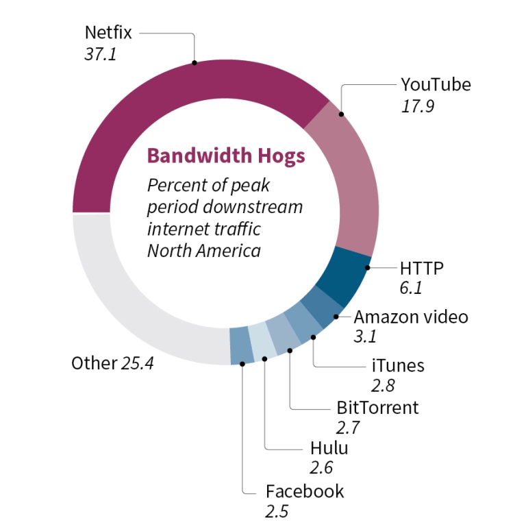
I’m not totally happy about the labels from HTTP down, they need tidying up in someway while keeping hierarchy in mind, and making sure the figures are readable. If space was unlimited I’d just pull them down and allow more white space, but in a still-graphic space is always limited so there might be better ways of finishing this. Either way I like preserving the parts of the whole and I think it’s interesting to see that Netfix and YouTube together take up more than half the total bandwidth.
My gripe with Andy’s makeover are the following:
- We loose sight of parts of the whole
- I disagree with putting “others” in second position — they’re the ones that we don’t care about, they should be a footnote
- The chart is inherently unattractive. Sure we can work on that, but dressing up bar charts is always a challenge
- There are more horizontal bar charts in existence in this world than there are doughnuts, so I would say bar chart fatigue is more of an issue than doughnut fatigue
- Logos are always a design nightmare. They are each designed to their own specs, they always necessarily clash, they make graphics look bad. Also why should we do their advertising for them?

Finally Andy did relent on the parts of the whole and so offered a stacked bar chart. To me that’s fine, though no eye-candy and I would just say, what’s to stop you from banding that lonely monolithic column round into a nice circle so the two ends meed, completing the whole?

Nice blog post.
This debate has always fascinated me. I must say I do find my self in the “anti pie chart” category most often than not, but your rework of the doughnut was great, especially with the legend.
If I may, though here the numbers allow for decently simple comparaison, the doughnut would really not help if, say, “other” was at 19% and “youtube” at 17.9%.
For instance, if it weren’t for the number captions, it would have been almost impossible to determine which one of the following is greater: amazon, itunes, bittorrent, hulu and facebook.
If the audiences capacity to understand the information is a priority, then the stacked bar, though a poorer eye candy, is better, because it allows to sort and compare more easily.
My two cents.
Harun
LikeLike
Hi Harun,
Thanks for your comments. I agree completely that a bar chart is always more useful for small differences. I guess the important point is in deciding which part of the story we want to tell. For example the pie works well for showing the dominance of Netflix and YouTube, but if we were focusing on the close competition for bandwidth between iTunes and BitTorrent then it might be better to do a different visualization that highlights that. To do that it might be more interesting to find data that shows changes in time. (Over a day? Over recent months?)
LikeLike